4. abstraction (representation)
This project was all about abstracting and representing a plant or animal with contour lines, as well as developing textures connoting some essence of our chosen form. As you'll see below, we were tasked with developing couture lines, first in pen or pencil then in Illustrator, of our plant/animal. We moved on to finding textures that represented some characteristic of our form, then mashed them together, creating rough "logos" with them. We then put them into Photoshop Mock-Up files to further develop them but also to make the whole experience more enjoyable. With out further ado, let's jump into my chosen unit form: the cobra.
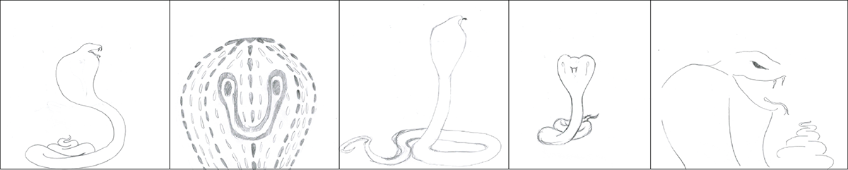
The King Cobra had always been a childhood favorite of mine. I thought that the curves of the hood and the coiling body would be fun to contour, and I was right. Above are my initial thumbnail sketches, in pencil. A decent start here, but most of the development happened in illustrator.

Here are a few of my many Illustrator variations. These are much better than the thumbnails as these are still contour lines, but are much more abstract. I tried varying the position of the cobra, as well as line thickness, line sharpness, and what part of the cobra I would focus on. In the end I decided I had to show the full body to accurately represent the cobra.
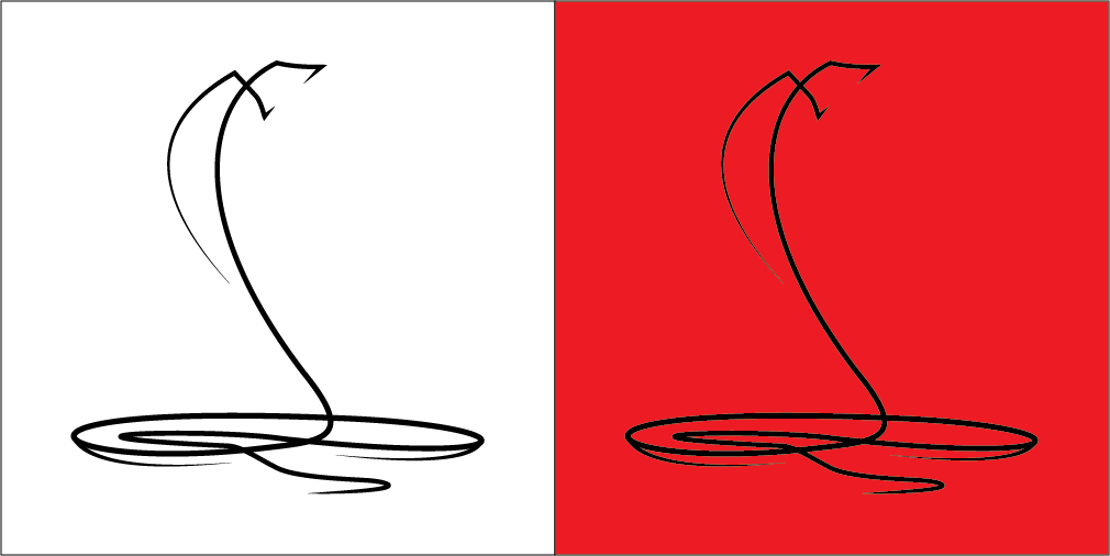
My final unit form. Out of anything in the project, I was most pleased with how this turned out. I kept the cobra in a side view, still in a striking position. I sharpened the fangs, making it more intimidating. I left some lines hanging unattached to the main body, using Gestalt's principle of closure to imply more weight to the body of the cobra. I also played around with a red background, making the cobra pop and also to separate it from the texture as you'll see later on. I used red because it is a strong and dangerous color, warning people about the cobra. With my animal contour done, I moved on to finding textures that went with it.

Above are 12 textures I found representing some characteristic of a cobra. We had to get our textures from a variety of sources, including pictures, printed sources, and self made textures made with Illustrator. Characteristics I thought of were words like dangerous, threatening, coiling, scaled, armored, and sharp. From the 12 textures, I picked my two favorites and developed black/white and color variations.


Here are the final two textures and the color variations I decided on. The thumbtack texture I picked immediately; it was my favorite because it nicely represented sharp, dangerous, threatening, and scaled all at once. I liked the thumbtacks much more than all of the other ones, so it was the only texture I ended up using for the mock-up files. As for the color choices, I chose red because it was a strong, bold, and dangerous color, and I chose green because it's a poisonous/venomous color. I only used red in the mock-ups. Here you see the texture in a gray-scale and also color variations, but for the final texture,- I went with a black and white Image-trace, as you'll see below.

The following are five pictures are my designs in five different Photoshop mock-up files. I tried separating the contour and the texture altogether as well as combining them, with the cobra still separated by being in a red box. I think they turned out great.


In the end, I had a lot of fun with this project. I learned a lot about abstracting, contour lines, and Photoshop mock-up files. If you want to see more of the early planning stages, and learn some more project related vocabulary, check out this Dropmark.

